St Francis Catholic College
School Brand Design
In 2022 CRC Melton began the process of changing its name and beginning a new journey. The new logo tells the story of St Francis of Assisi and the College, while pointing toward the future development of 2 campuses.
The elements in the logo contain rich symbolism and deep messages. The shield with the Tau cross represents St Francis' journey from being a soldier to his conversion, turning to God. The thinner black cross connects to the original CRC Melton logo and is a reminder of the rich history of the past 42 years.
The Franciscan belt hung on the cross speaks to the Franciscan order established by St Francis. The three knots symbolise the trinity to which Francis was so devoted. And below the shield is the open book, the gospels which underpins all that is done at the college, symbolising the lived experience that St Francis Catholic College students will encounter.
As the patron saint of ecology, St Francis had a deep affection for flora and fauna and all of God’s creation. It was therefore important to include the symbol of the Eucalyptus Macrocarpa or grey box native to the western parts of Melbourne. With a small forest protected and managed since 1988 between Melton and Eynesbury, the symbol connects the College to the local area. It reminds us of our obligation to care for our environment.
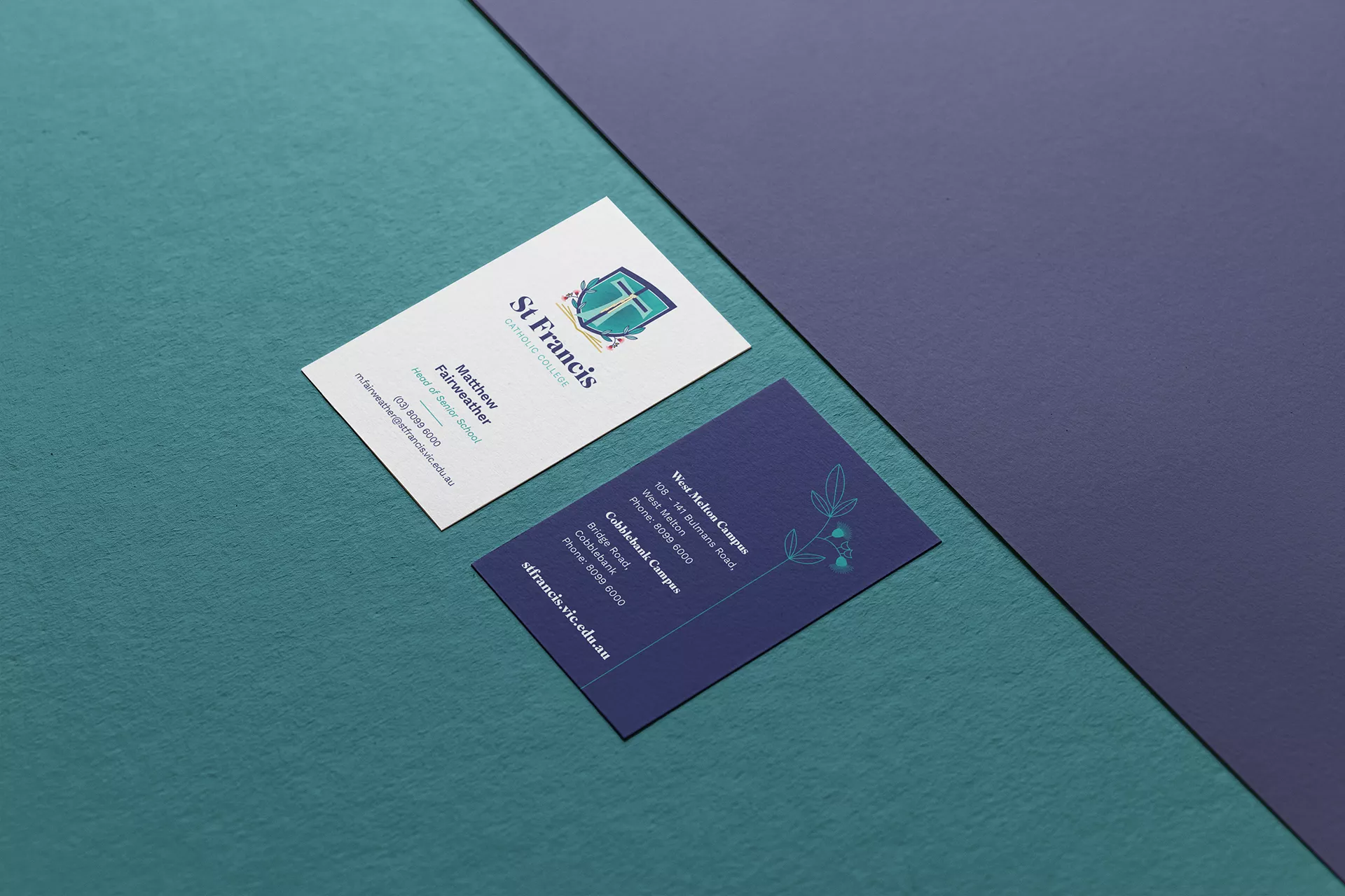
With the establishment of the logo it was important to also develop guidelines that will assist the college in maintaining their new image. Other brand elements such as letterheads, business cards and templates were developed in consultation with the college and then compiled into a brand guidelines book that will be used to provide direction in the years to come.
Brand design | Corporate Identity | Brand Guidelines | Print Media Design